Creative direction, art direction and design
for cut-through campaigns and standout brands.

Identity
Regency

Identity
Regency
Services
Creative Direction
Strapline creation
Art Direction
Graphic design
Website design and build
Marching to a different beat.
Regency are the culmination of three specialist businesses coming together. And what they form is actually something pretty unique in their space.
Together they form a business that is focused acutely on delivering three services really, really well. Unlike the huge ‘catch all’ property service providers, Regency dedicate all their expertise to make sure that the specific services they provide are seamless and well-oiled, meaning they can offer a reassurance to their customers that few others can match.
This informed our brand positioning – with Regency everything runs like clockwork – and their strapline ‘Real estate in rhythm’.
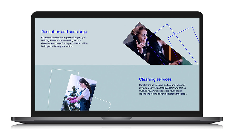
The copy, the identity and every touchpoint reinforces the idea of a friendly empathetic team, that understands customer properties and how to help them operate and run silky smooth.

The crown symbol subtly links buildings and architecture with the name, and informs a wider identity that avoids the usual need to show pictures of staff or equipment from the get go.

Unlike most of the competitors, the messaging doesn’t focus on Regency itself. Instead it focusses on how the customer stands to benefit.


