Creative direction, art direction and design
for cut-through campaigns and standout brands.

Identity
CORE Store

Identity
CORE Store
Identity
CORE Store
Unboxing a new self-storage brand
Why do most self-storage brands look the same? Beyond a few players, its amazing how little originality there is in the industry how many opt for a blue/yellow palette, a non-descript identity, a carbon copy website, and very little in the way of marketing activity.
For Core, and their drive-up self-storage offer, we saw a different future. A brand that stood a chance of elevating the business beyond the 'which is nearest/cheapest?' conversations that most customers have when choosing their storage unit.
Could we create a brand to eventually rival its famous Yellow competitor? Time will tell. But with an ambitious client that is happy to tread a different path, its a very promising start...
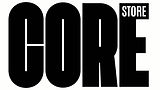
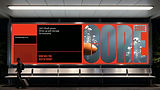
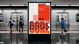
An identity based on the principles of tightly stacked letterforms and graphic elements is a simple and effective way to stay true to the 'No Phaff' principle of the brand.
But that doesn't mean we can't be a bit playful when its comes to our awareness activity.